 |
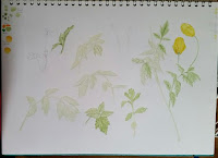
| Watercolour sketch page - Sarracenias |
It’s been too long since I last wrote a blog post, I’m afraid life rather got in the way, but I’m back with something that’s been bothering me for a while. Grab a cuppa and maybe a biscuit, this is a long read
As well as being a Botanical Artist, I am Botanical Painting Tutor for the London Art College and have noticed how difficult starting off in Watercolour can be. There’s a saying that Watercolour is the easiest medium to pick up, but the most difficult to master and in some ways I would agree with this.
I think a lot of that is Where to Start ? When faced with an art shop full of materials and there’s so much choice, it’s really confusing.
There’s also confusion about what is the most important element of painting in Watercolour. Because it’s called Watercolour painting, you’d think that the most important element would be the paint.
But it isn’t !
As I’ve written further down the page, as long as you are purchasing decent bands of professional paint, even the modern student grades will be good. The range of colours are limited, you do have to check for single/transparent pigments, and they may not be quite as strong as the professional range, but these are minor problems when you are starting out, and are an advantage for beginners in the case of limited range of colours and the very strong Phthalo pigments.
In fact, the most important elements in order of importance is 1. Paper 2. Brushes 3. Paint.
That’s right, Paper is the most important element !
Why? Because it doesn’t matter how experienced you are, or how wonderful your brushes are, or that you have the finest paint. All this is nothing if your paper is poor or inconsistent or it doesn’t suit your way of working.
1. PAPER
Even the most experienced watercolour artists can have problems when the paper becomes inconsistent and I’ve written about that here in PAPER MATTERS. Katherine Tyrrell has written about Watercolour Paper in more depth here https://www.botanicalartandartists.com/botanical-art-paper.html scroll down the page to find out what happened when a previously beautiful watercolour paper changed.
As well as being a Botanical Artist, I am Botanical Painting Tutor for the London Art College and have noticed how difficult starting off in Watercolour can be. There’s a saying that Watercolour is the easiest medium to pick up, but the most difficult to master and in some ways I would agree with this.
I think a lot of that is Where to Start ? When faced with an art shop full of materials and there’s so much choice, it’s really confusing.
There’s also confusion about what is the most important element of painting in Watercolour. Because it’s called Watercolour painting, you’d think that the most important element would be the paint.
But it isn’t !
As I’ve written further down the page, as long as you are purchasing decent bands of professional paint, even the modern student grades will be good. The range of colours are limited, you do have to check for single/transparent pigments, and they may not be quite as strong as the professional range, but these are minor problems when you are starting out, and are an advantage for beginners in the case of limited range of colours and the very strong Phthalo pigments.
In fact, the most important elements in order of importance is 1. Paper 2. Brushes 3. Paint.
That’s right, Paper is the most important element !
Why? Because it doesn’t matter how experienced you are, or how wonderful your brushes are, or that you have the finest paint. All this is nothing if your paper is poor or inconsistent or it doesn’t suit your way of working.
1. PAPER
 |
| A selection of Watercolour paper samples with tests |
Even the most experienced watercolour artists can have problems when the paper becomes inconsistent and I’ve written about that here in PAPER MATTERS. Katherine Tyrrell has written about Watercolour Paper in more depth here https://www.botanicalartandartists.com/botanical-art-paper.html scroll down the page to find out what happened when a previously beautiful watercolour paper changed.
 |
| More Test samples with cut sheets |
So what paper to choose? This is a huge question and perhaps the best answer is to either buy sheets of the paper you want to try and cut them down to suit, or if you have no idea, order a sample pack of watercolour papers. These are packs of paper either from different manufacturers - eg different brands and different types and weights, or a sample pack from a single manufacturer with their different types and weights of watercolour paper. Just make sure the papers are for Watercolour though as anything else is a waste of money. I tend to recommend Saunders Waterford papers, because they do a nice range of student and 100% cotton papers which are reliable and stand up to the different techniques used, and they do a really nice sample pack to try out. But Art materials suppliers also do watercolour sample packs too, which gives a wider range of papers and Brands to try out. My recommendation is to try out as many papers as you can afford and keep notes on the different papers, which ones you like and why, which ones you don’t like and why, so that you can refer back to them later. Go for at least 140lbs/300gsm and you may be able to paint without the paper cockling (warping) depending on how much water you use.
Buying a single sheet and cutting it down to eg. 7½ x 5½ inches (19x14cms) will give you 16 sheets to practise on.
2. BRUSHES
 |
| Sable Brushes and Synthethic brushes with a tiny paint tin |
Brushes can be a source of pleasure when painting, or a source of endless frustration. A good brush should hold paint or water and let it out in a controlled way, there should be no flood of paint or water releasing suddenly from the hairs. It should also hold its point when wet. You can test this by swishing in water and then shaking the brush with a quick flick. The hairs should form a point and the brush should look ‘clean’ with no hairs sticking out. If they don’t, or the point is split, you will struggle to control your mark making and will struggle to make fine details. This is fine if you paint very loosely, but if you want to paint in a realistic way will make things unnecessarily difficult.
Whether you use Sable or Synthetic is a personal choice, look for a brush with a nice point, that holds plenty of water/paint for its size and doesn’t dump it all at once. Whether Sable or Synthetic, look for a specialist brush manufacturer. Prices depend on size and shape. Specialist brush makers such as Rosemary & Co, DaVinci, Escoda, Raphael, Winsor & Newton etc all make both Sable and Synthetic watercolour brushes that are excellent. Be aware that brush sizes aren’t standardized, so sizes in different brands will be slightly or markedly different, there’s usually a picture on the brand’s websites showing their brushes in the different sizes.
It’s better to buy just two really good pointed round brushes of different sizes – eg #2 and #4, than to buy a large set of inferior brushes. You’ll get more use out of the good ones and will find that they help you paint rather than hinder.
When painting with your lovely new brushes, take care to NEVER lift paint from the pan or mix paint with them, it’s the fastest way to ruin them. Instead, use a cheap synthetic brush and keep it just for that purpose. Also, use a brush size that is suitable for the amount of paint you need, using a huge brush to lift and mix paint can lead to most of the paint ending up in the water jar.
When using your brushes, ensure you have just the right amount of water in the brush before you pick up paint. A folded soft cotton face flannel is useful for wicking water out of the brush and with experience you will know just how damp to leave it. I use white cotton flannels as they show if there is paint on them, and can be laundered to remove stains. When picking up paint from the palette, gently roll the brush to remove excess paint and form the point, this should leave you with the right amount of paint and a controlled shape to work with. A spare piece of watercolour paper can be used to test your colour and ensure the right amount of paint for your painting.
3. PAINT
 |
| Watercolour pans and tubes showing Pigment numbers |
There are so many different makes of paint, so many different colours, and if there are so many, you need them all right? Well, no.
I’ve spent a lot of time and money trying out the different brands, as many as I could find locally and a few that weren’t. And it’s my experience that provided you stick to the well established professional brands (Daler Rowney, Daniel Smith, Senellier, Schmincke, Winsor and Newton, to name just a few and in no particular order except alphabetical) even their modern student ranges will be perfectly suitable for starting off, as long as you stick to a few rules.
Get just a few tubes or pans, and stick to transparent colours.
Why transparent? Because there is less chance of mixing mud.
The main reason some colours/mixes produce mud is that opaque and/or granulating pigments have been used in the colour/mix and this can lead to very muddy looking colours. Have a look at my blog post HOW MANY COLOURS DO YOU NEED TO PAINT FLOWERS ?
You’ll find that the answer is a lot less than you think. If you look at the images there, you can see that even with only the three colours, I haven’t made mud. This is because all the colours used are transparent. With the six colours, every colour you could possibly see can be mixed without making mud. The three or six colours you choose are really important though, as some colours are more suitable for this method than others, which is why I’ve given both the colour names and the pigment numbers – not all colours use the same pigments across the different brands so do check both colour name and pigment number to be sure.
By using transparent colours, you’ll reduce the frustration level straight away and can wait until you are confident with your paper and your watercolour techniques to try out those interesting granulating colours and opaques, but without limiting the number of colours you can make.
By using a limited number of colours, you’ve done two things,
1. You’ve saved money on paint, Watercolour goes a really long way, hence the tiny tubes and pans. You can use the dried paint on the palette and you can even use paint dried in the tubes as pans by peeling off the tube. Try doing that with oils or acrylic! Hopefully you will find using the paint you have less intimidating because you don’t have to decide which colours to use.
2. You can concentrate on learning how many colours can be made and the subtle changes you can make with just a touch of one or two of the colours in the mix. I recommend that you keep notes and swatches/charts to remind you of paint mixes, this helps because you don’t have to start from scratch every time you paint. Which means you can concentrate on techniques.
My suggestions for limited colour palettes. The numbers refer to the Pigment numbers eg Pigment Blue 15 (which is Phthalo Blue) and can be found on the label of the pan or tube. Note, these are only suggestions, you may find that these colours have different names. The colours here produce the widest range of colours when mixing.
Three colours
PY175 Lemon Yellow, PR122 Quinacridone Magenta/Quinacridone Purple, PB15 Phthalo Blue (Green shade or Red shade)
Six Colours
PY175 Lemon Yellow,
Indian Yellow or New Gamboge (whichever is transparent, both are a mix), Permanent Alizarin Crimson, PR122 Quinacridone Magenta, PB 15 Phthalo Blue (green shade), PB60 Indanthrene/Indanthrone Blue (or French Ultramarine).
More reading on colour and paper
More reading on colour and paper


