“Paint what you
really see, not what you think you ought to see; not the object
isolated as in a test tube, but the object enveloped in sunlight and
atmosphere, with the blue dome of Heaven reflected in the shadows.” - Claude
Monet
In April I wrote
about this year’s SBA exhibition, and the paintings I had exhibited
there. I was tremendously encouraged to be told that one of my
paintings had been awarded the Certificate of Botanical Merit – the
Echeveria cante.
It was a wonderful
plant to paint, since it's such a challenge. In full sun, the
plant can be blindingly white, on dull days the plant can look grey.
On the day I saw
this plant for the first time, it was very sunny, and as I
looked at the plant, a cloud covered the sun. In that moment, the
plant came alive with colour and I knew that I must capture it for
others to see.
First task was to
get an accurate record of the colours, using my trusty mini paintbox
and travel brushes. Then measured drawings and notes made
of the plant from different angles in order to capture as much
information as possible.
Once back in my
studio, I decided on a small study, in order to work out how to
render the colours and textures and work out which colours and colour
mixes would best express the glowing quality of the plant. In this case, I
decided on Cobalt Turquoise and Cobalt Blue as the Blues for the palette, as I felt they had just
the qualities I was looking for.
 |
| Echeveria cante Study - First Washes |
 |
| Echeveria cante Study - Further Work |
Once I was happy
with the choice of colours, I made an inked copy of the composition
on tracing paper. This is used to transfer the composition to the
watercolour paper via a lightbox, and is also insurance against
having to start the painting from scratch in the case of disasters - flying brushes usually!
 |
| Echeveria cante - first washes |
 |
| Echeveria cante - Growing nicely! |
 |
| Echeveria cante - Further work |
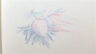
At first, the washes were laid in very lightly. I wanted to make sure that I kept the tones light at this stage, and for the same reason the reds were left until last- deeper and brighter tones would add punch, but would not reflect the delicate colours and textures of the plant. I decided to work in stages so that I could keep already painted areas clean by covering them as I worked.
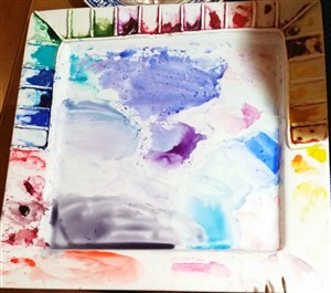
At this stage, this is what my palette looked like. I tend to mix on the fly once I have chosen my colours. This ensures plenty of variety in the colours of the painting and keeps me on my toes matching colours to the plant. The grey at the bottom is mixed from the colours in the painting - in this case, Cobalt Blue, Permanent Magenta and a Transparent Lemon. This grey is then used to increase the range of tones in the painting and is also used for the very darkest areas - tiny areas of dark that help to lift the whole painting.
Once I was happy with the colours and tones of the main part of the inflorescence, it was time to lay in some of the reds. A light wash of yellow went on first, which helped the more orange reds to glow nicely. Then, the different reds were painted in - lightly at first so as not to overpower the rest of the plant.
Now it was time to add the stem, and reassess all of the colours. The details of the Stamens and Carpels were left until last and added a final touch of realism to the painting.
At this point the painting was put away for a few weeks. I do this because working so intensely, it's easy to lose perspective. After a few weeks, the painting is reassessed and any problem areas are more easily spotted and remedied
I hope this Step by Step has given some insight into how this painting evolved and the techniques used to finish it.
Next up - Paper testing!
At this stage, this is what my palette looked like. I tend to mix on the fly once I have chosen my colours. This ensures plenty of variety in the colours of the painting and keeps me on my toes matching colours to the plant. The grey at the bottom is mixed from the colours in the painting - in this case, Cobalt Blue, Permanent Magenta and a Transparent Lemon. This grey is then used to increase the range of tones in the painting and is also used for the very darkest areas - tiny areas of dark that help to lift the whole painting.
 |
| Echeveria cante - laying in some reds |
Once I was happy with the colours and tones of the main part of the inflorescence, it was time to lay in some of the reds. A light wash of yellow went on first, which helped the more orange reds to glow nicely. Then, the different reds were painted in - lightly at first so as not to overpower the rest of the plant.
Now it was time to add the stem, and reassess all of the colours. The details of the Stamens and Carpels were left until last and added a final touch of realism to the painting.
At this point the painting was put away for a few weeks. I do this because working so intensely, it's easy to lose perspective. After a few weeks, the painting is reassessed and any problem areas are more easily spotted and remedied
 |
| Echeveria cante - finished! |
Next up - Paper testing!


