Lately, I have noticed that my favourite Watercolour paper has changed. When I can work on it, it's jolly hard work - but without the jolly bit. In fact, I have found myself with paintbrush in one hand and a brush full of gelatine size in the other. I did at first think it was me. Painting isn''t one of those things that you just sit down and do, some days it goes well, and some days you wish you were a photographer, although, I'm sure photographers have bad days too!
So it was with a heavy heart that I decided that I would look for another paper to work on.
I like working on Daler Rowney HP, but it only comes in 140lbs, which is ok for really small stuff, but not so good if you want to work bigger and have larger areas of paint. It cockles. And before someone tells me to stretch the paper first, yes, this works for some people, but I prefer to keep the sizing where it is, and anyway, that means I would have to keep several pieces ready prepared and stuck to boards, and since my studio space is tiny this really wouldn't work for me. There's also the problem of availablility with DR HP, it being available in sheets only from one supplier which means a two hour plus round trip - and that's if I'm lucky!
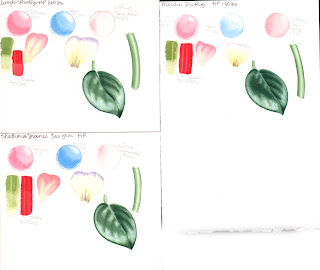
So, as I was taking the trouble to test out several papers I thought it would be of interest to others and I'm putting it here, because there's quite a lot of information.
Each test was conducted with the same paints and brushes. I tried to make sure the only variable was the paper, but the weather decided to get involved too and some of the tests were conducted on very hot dry days and some on very wet days, although I think the main problem that posed was drying speed so I haven't commented on speed of drying.
The paints - all from Sennelier - French Ultramarine(PB29) Sennelier Yellow Light (PY154 ) Rose Madder Lake(PV19) Sennelier Red(PR254) and Sennelier Olive (the old one PO49,PG36) I don't normally use ready mixed greens but this one is very useful as a base and is totally transparent.
Paper
Tests - please click on the photos for a larger version
 |
| Papers from Saunders Waterford |
Saunders
Waterford HP 140lbs High White – New Improved 100% cotton
Fine surface, very smooth both
sides.
W-in-W
Paint spread on the damp surface quickly and blurred softly. Easy
to soften edges.
Petal
– Edge colour bled nicely, no manipulation needed. Markings fine
and sharp.
Leaf
– W in W spread almost too much but lovely soft result and well
controlled. Subsequent dry brush work also soft.
Stem
– paint spread from the edges nicely and a quick sweep of the brush
down the middle created a nice ‘shine’ dry brush to edges
softened nicely.
Edges
clean-up ok if paint not too dry
Green
paint – didn’t lift much after drying. Red paint – hardly any
lifting after drying
All
colours nice and bright. Reverse of paper seems easier to work on
and results cleaner.
Some
cockling even when dry, I would love to try this in a 200lb or 300lb version.
A
lovely paper to work on, but lifting after drying is a problem.
Saunders
Waterford HP 140lbs High White
Slight
texture on surface. Reverse more regular pattern
W-in-W
Paint spread on the damp surface quickly and blurred softly. Easy to
soften edges.
Petal
– Edge colour bled nicely, no manipulation needed. Markings fine
and sharp.
Leaf
– W in W spread almost too much but lovely soft result and well
controlled. Subsequent dry brush work also soft.
Stem
– paint spread from the edges nicely and a quick sweep of the brush
down the middle created a nice ‘shine’ dry brush to edges
softened nicely.
Edges
clean-up ok if paint not too dry
Green
paint – didn’t lift much after drying. Red paint – hardly any
lifting after drying
All
colours nice and bright. Despite texture, edges clean and fine
lines clean.
Nice
to work on but needed a little more water
Saunders
Waterford Ultra Smooth HP 300gsm 50% cotton
Very smooth paper both sides
W-in-W paint spread
nicely, needed a little extra work. Easy to soften edges. Red
lifted well
Petal – Edge colour
bled nicely, needed a little extra work. Nice effect. Sharp clean
lines
Leaf – Needed extra
work for W-in-W underpainting, but dry brushing very soft effect and
clean sharp edges.
Stem – Very difficult
to get effect
Green paint lifted leaving
lighter green line. Red paint barely lifted leaving a slightly
lighter red.
Edges clean and well
defined and easy to clean up.
All colours bright.
Saunders
Waterford Bockingford HP 300gsm White
Very smooth paper both sides.
W-in-W paint spread
nicely and easy to control. Edges easy to soften. Red lifted well.
Petal - Edge colour
spread nicely, good effect. Sharp clean detail lines
Leaf – W-in-W spread
well, dry brush effect soft and deep. Edges easy to clean up.
Stem – W-in-W easy to
control, highlight lifted nicely .
Green paint lifted leaving a
clean light green line. Red lifted leaving a red line, but not
sharp.
Edges clean and easy to
clean up.
Colours bright.
 |
| D-R Langton Prestige, Moulin du Roy and Strathmore Imperial 500 |
Langton
Prestige HP 140lbs 100% cotton
Slight
texture on one side and smooth on reverse. Feels very soft to the touch.
W-in-W
- Paint dispersed nicely and edges softened nicely. Red paint
lifted almost clean away.
Petal
– edge paint bled nicely, little or no manipulation. Markings fine
and sharp.
Leaf
– W-in-W spread nicely, well controlled. Dry brush soft effect.
Stem
– Edges pread nicely and easy to lift shine in the middle. Darker
edging easy to soften.
Edges
clean up easy
Green
paint hardly lifted. Red paint both first and second layer lifted
slightly.
All
colours nice and bright. Texture didn’t affect clean edges or
sharp details.
Lovely
paper to work on.
Strathmore
Imperial 500 HP 140lbs 100% cotton
Much
heavier texture than most HP papers. Random texture on front and noticeable
pattern on reverse.
W-inW
inactive paint didn’t spread much. Difficult to soften edges. Red
paint lifted almost clean.
Petal
– Edge colour needed persuasion to soften. Fine lines needed more
than one sweep.
Leaf
- W-in-W spread far too much, soft effect but lacked control –
maybe over compensation after first three attempts? Dry brush ok,
not too harsh.
Stem
– Took longer to persuade paint to spread, several attempts needed.
Highlight present but mechanical looking.
Green
paint lifted a little. Red paint sat on top of paper, but clean
lines when lifted but not to white.
Paper
cockled badly when wet but dried flat.
I
found this a more difficult paper to work on.
Canson
Moulin du Roy HP 140lbs 100% cotton
Very
smooth paper, felt it was very like Arches.
W-inW
paint spread well, but curiously when dried the colours seem faded.
Difficult to soften edges and it shows! Lifting of the red
unsuccessful.
Petal
– Edge colour didn’t spread in and not successful. Colour when
dried very feint.
Leaf
– W-in-W spread well but colours feint and needed more than one
wash. Dry brushing also needed more work. Effect soft.
Stem
– W-in-W needed a lot of work. Doesn’t look as effective as
others.
Green
paint lifted well. Red paint sat on surface but lifted well, lines
clear and defined, but not white.
Didn’t
like working on this, and wasn’t impressed that the wash colours
looked so faded
 |
| Fabriano Artistico 640gsm (old) |
Fabriano
Artistico HP 640gsm (old) 100% cotton
This
paper is a few years old. It’s difficult to tell which side is
which even with a strong magnifying glass. Both sides are very
smooth and I painted on both sides too.
W-in-W
paint spread out nicely leaving a soft effect. Edges were easy to
soften. Lifting of red was mostly successful.
Petal
– Edge colour spread inwards beautifully and gave exactly the right
effect. Sharp lines nicely defined.
Leaf
– W-in-W spread nicely, easy to control. Dry brushing gave nice
deep colour and very soft effect. Edges very sharp
Stem
– W-in-W easy to control and highlight easy to lift leaving a
convincing shine.
Edges
cleaned up well
Green
paint lifted leaving a slight colour. Red paint was lifted leaving
lighter red.
Colours
not quite as bright as Saunders Waterford and Strathmore, but well
defined and clean.
Lovely
paper to work on.
 |
| Fabriano Artistico 300gsm (old) |
Fabriano
Artistico HP 300gsm (old) 100% cotton
This
paper is also a few years old, Both sides very smooth and difficult
to tell back from front even with strong magnification.
W-in-W
paint spread nicely, easily controlled. Soft effect. Edges easy to
soften.
Petal
– Edge colour spread inwards nicely, giving the effect wanted.
Fine lines sharp and clean.
Leaf
- W-in-W easily controlled spread. Dry brushing soft effect, no
harsh lines/
Stem
– W-in-W easy to control and highlight easy to lift.
Edges
cleaned up well
Green
paint lifted easily leaving lighter green. Red paint lifted leaving
sharp lines of lighter red.
Colours
not as bright as Saunders W and Strathmore but well defined and
clean.
Lovely
paper to work on but slight cockling.
Fabriano
Classico HP (old)
W-in-W
paint spreads nicely, soft edges easy to achieve.
Green
(Senn. Olive), Red (PR254), Rose (PV19) Blue (PB29) All lifted
similarly leaving a very light clean line
Smooth
paper
SW Bockingford HP 140lbs - this is from a large sheet.
I often use this paper if I want to try out different things, or just for sketching. It's a lovely smooth paper which takes a wash nicely and also dry brushing. It's also very consistent and reliable which is very useful if you're sketching, as you can concentrate on what you're doing, rather on coping with variable paper.


