Monday 17 April 2023

Starting To Paint Botanical Art for Younger People and Students

Watercolour Comparisons by Polly O'Leary - Schmincke Akademie-Daler Rowney Aquafine-Winsor and Newton Cotman
Seeing Triple!


Prompted by being contacted by several young people, about how to go about painting Botanical subjects in Watercolour, and asking what paints and colours to use, and by the new  Young Botanical Artist Competition 2022/3 by the Sherwood Gallery, in collaboration with Royal Botanic Gardens, Kew, I set about checking out the student/enthusiast ranges of well known brands of Watercolour.


I would normally recommend using a small selection of Artists/Professional watercolours, however  the price of Artists/Professional quality watercolours has rocketed over the past two years, and while it is still possible to buy some Artist’s/Professional watercolour sets or sample sets at more reasonable prices, if you can find them in a sale, these sets often exclude the colours needed for basic colour mixing, while including colours that aren’t useful if they are your only watercolours.  

Especially for Botanical Art, the right yellows, reds and blues can make all the difference to your colour matching and mixing.

However, don’t despair, you can still learn all the important techniques of watercolour and paint Botanical Art with limited funds, and get super results. 

One thing you will notice in my Paint-Outs, is that in the Aquafine and Cotman Sets, I have removed the Yellow Ochre and replaced it with Quinacridone Gold.  This is because they are my Field Study kits and Quinacridone gold is far more useful to me than Yellow Ochre PY42, which in both cases is Opaque.  I didn't use Quinacridone Gold in the Comparison paintings above, nor did I use Yellow Ochre, so it isn't a must-have, but will extend or speed up your colour mixing. 

All the Paint-outs were made using exactly the same brush, paper and method, the same number of swipes across each pan and the same number of swipes across the paper for each swatch.


Side by side Comparison of Aquafine, Cotman and Schmincke Akademie Watercolours by Polly o'Leary

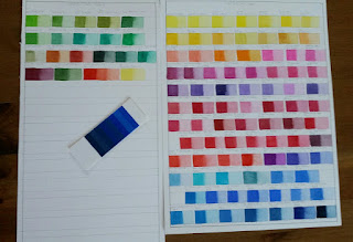
Side by Side Comparison of each Set of colours


Student/Enthusiast brands that are comparable in handling and quality to Artist’s / Professional watercolours in alphabetical order :


Paint-out of Schmincke 10 Half Pan Akademie Watercolour Set by Polly O'Leary

Akademie Set Colours - No Additions


Schmincke Akademie – 24 colours - 16 single pigment, 5 double pigment mixes, 3 triple pigment mixes

https://www.schmincke.de/en/produkte/aquarell/akademie-aquarell 

Pros - Brilliant colours, the same pigments as found in the Horadam Artist’s watercolour range, finely milled, excellent re-wetting, colours easy to lift from the pan, lovely to work with.  All Schmincke Paints are manufactured in Germany.
Cons – can be difficult to find in the UK and often a lot more expensive than the other brands, but this may be different in other countries, smaller colour range (but all the basic colours covered).

---<>---


Paint-out of Aquafine Watercolour 10 Half Pan Set with Additions by Polly O'Leary

Aquafine 10Pan Travel Set colours + 1 change, + Additions


Daler Rowney Aquafine -  46 colours (not including metallics) - 27 single pigment, 14 double pigment mixes, 5 triple pigment mixes


https://www.daler-rowney.com/aquafine-watercolour-paint/ 

Pros - Brilliant colours,  many single pigment colours, finely milled,  excellent re-wetting, and very easy to lift from the pan, lovely to work with.  Most are the same pigments as found in high quality Artist’s/Professional watercolour ranges.  Excellent price point and easily available.  Sets, tubes and twin half-pan packs easily available.  Daler Rowney Paint is manufactured in the UK.
No Chalkiness (I know this has been a problem in the past with this range)
Price – This was the cheapest set to buy, and the replacement pans were also cheapest, they also came in pairs, so you get 2 for the price of one !  You simply need to choose the pair that works best for you.  Don't let the price put you off, they still work really well.
Cons - smaller colour range than professional ranges, but all basic colours covered.


---<>---


Paint-out of Cotman Sketchers Pocket Box with changes/additions by Polly o'Leary

Cotman Sketcher's Box colours + Changes/Additions


Winsor and Newton Cotman –  40  colours (not including metallics) –  19 single pigment, 16 double pigment mixes, 5 triple pigment mixes


https://www.winsornewton.com/uk/paint/watercolour/cotman-watercolour/ 

Pros - Good colours, handle well.  Sets, Pans and Tubes easily available.  
Cons -  For me, too many of the basic colours are mixes - eg. yellows/reds.  I feel that some of the yellows and reds seem less transparent in use despite being labelled transparent.  Smaller colour range, but all basic colours covered.  Pans didn't release colour easily as the other brands and it took more work to get the same depth of colour.  If you have these, you may wish to pre-wet the pans with a light mist of water.  


----------<>----------

Method

I have stayed with the well known brands, for reliability and confidence in their information on light-fastness and transparency/opacity.   Information on the pigments used and light-fastness are available on their websites.

In the interests of being thorough, I tested out the three student/enthusiast’s ranges, using their smallest half pan ‘set’ as a base, assessing the usefulness of the colours included and the cost of adding colours to extend the palette to give more range and vibrancy.

To conduct the test, I painted a bright image with a good range of subtle and vibrant colours with each of the sets, along with a black grape to test out the ability to mix deep blacks without using a black pigment, and an unripe blueberry to test out the range of reds and pinks and how they worked with the blues.   

I used Daler Rowney Langton Hot Press (Botanical) watercolour paper, which I’ve had for a long time and works well for me.  It isn’t cotton paper, however it is 100% wood-free acid-free paper (as is Bockingford).  So should last well.

----------<>----------


The Paints used were

Schmincke Akademie Watercolour Travel Set

Schmincke Akademie  – Set of 10 half pans –  * Pigment or mix also used in Artist's ranges.  

Suggested additions, Magenta PV42*  Cyan*   

Orange* instead of English Red.  Not a direct swap, but as it's transparent, will give more range for mixing browns.

Quinacridone Gold* instead of Yellow Ochre (whichever one suits you best)

French Ultramarine PB 29*
Carmine PV19*
Cadmium Red Tone PR255*
Indian Yellow PY110,PY154*
Light Lemon PY3*
Permanent Green PO62,PG7*
Prussian Blue PB27*
Sepia PB15.1,PBr7,PBK9*
English Red PR101*   (Very Opaque)
Yellow Ochre PY42*   (Very Opaque)

----<>----
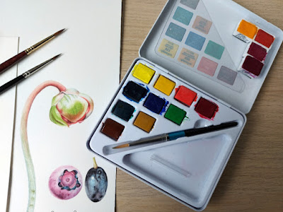

Daler Rowney Aquafine Watercolour Travel set with trial Paintings

Daler Rowney Aquafine Watercolour Travel Set


Daler Rowney Aquafine  - Travel Set 10 Half pans + 4 Extra - * used in Artist's ranges
 

Suggested change - Quinacridone Gold* instead of Yellow Ochre (whichever brand suits you best)

Lemon Yellow PY3*
Cadmium Yellow Hue PY155*
+Indian Yellow Hue PY65*    (added to extend the range of yellows)
+Cadmium Orange Hue  PO71* (Added because it came with the Indian Yellow!)
Vermilion Hue PR255* 
Alizarin Crimson PR176*
+Quinacridone Magenta PR122*    (added for a Pink option)
+Purple Lake PV19*     (added because it came with the Q.Magenta!)
Prussian Blue PB27*  
Ultramarine PB29*  
Leaf Green PY3,PG7* 
Viridian Hue PG7*  
Quinacridone Gold* (replaces Yellow Ochre PY42 which is fiercely opaque) 
Burnt Sienna PR101*  

----<>----


W&N Cotman Watercolour Sketcher's Pocket Set with Trial Paintings

W&N Cotman Watercolour Sketcher's Pocket Set


W&N Cotman watercolours – Sketchers Pocket Box - set of 12 half pans – * used in Artist's ranges

Suggested change - Quinacridone Gold* instead of Yellow Ochre (whichever brand suits you best)

Lemon Yellow Hue PY175*     (replaced the Cad Yellow Pale Hue which wasn’t transparent)
Cadmium Yellow Hue PY197, PY65   
Cadmium Red Pale Hue PR255, PY65   
Alizarin Crimson Hue PRN/A, PR206* 
+Permanent Rose PV19*   (Replaced Chinese White which I have no use for)  
Ultramarine PB29*
+Intense Blue (Phthalo Blue) PB15* (Replaced Cobalt Blue Hue – a mix and not different enough to Ultramarine.  Sketcher's box now seems to contain Cerulean Hue)  
Viridian Hue PG7*
Sap Green PY139,PG36,PR101  
+Q. Gold*  (replaces Yellow Ochre PY42 which is fiercely opaque)  
Burnt Sienna PR101*  
Burnt Umber PBr7, PY42

CONCLUSION


While I have my own preferences regarding which of these sets works best for me, any of them would be a good starting place for someone with serious intent and not a lot of money to spare, who may be daunted by using the expensive paints they've bought, or are reluctant to 'waste' expensive paints at the beginning of their journey.  The lower price means that essential play, experimentation and practise, as well as more serious paintings, are possible without fear of incurring high costs in replacements, or fear of 'wasting the good paints'.  The whole point of these paints is that they will give excellent results while building confidence.

They also allow upgrading to professional grade paints in the future, as and when each colour runs out, but with no urgency to do so.  

So there you have it.  Student/Enthusiast Watercolour quality of the best known Paint Manufacturers has come a long way in the last decade.  There are slight differences between these paints and the Artist's ranges, but this shouldn't put you off if you are just starting out on your watercolour journey, or the cost of buying/replacing watercolours is a challenge for you.


Sunday 14 June 2020

TIPS FOR STARTING OFF IN WATERCOLOUR


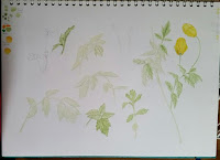
Watercolour sketch page - Sarracenias


It’s been too long since I last wrote a blog post, I’m afraid life rather got in the way, but I’m back with something that’s been bothering me for a while. Grab a cuppa and maybe a biscuit, this is a long read


As well as being a Botanical Artist, I am Botanical Painting Tutor for the London Art College and have noticed how difficult starting off in Watercolour can be. There’s a saying that Watercolour is the easiest medium to pick up, but the most difficult to master and in some ways I would agree with this.


I think a lot of that is Where to Start ? When faced with an art shop full of materials and there’s so much choice, it’s really confusing.


There’s also confusion about what is the most important element of painting in Watercolour. Because it’s called Watercolour painting, you’d think that the most important element would be the paint.


But it isn’t !


As I’ve written further down the page, as long as you are purchasing decent bands of professional paint, even the modern student grades will be good. The range of colours are limited, you do have to check for single/transparent pigments, and they may not be quite as strong as the professional range, but these are minor problems when you are starting out, and are an advantage for beginners in the case of limited range of colours and the very strong Phthalo pigments.


In fact, the most important elements in order of importance is 1. Paper 2. Brushes 3. Paint.


That’s right, Paper is the most important element !


Why? Because it doesn’t matter how experienced you are, or how wonderful your brushes are, or that you have the finest paint. All this is nothing if your paper is poor or inconsistent or it doesn’t suit your way of working.


1. PAPER

A selection of Watercolour
paper samples with tests


Even the most experienced watercolour artists can have problems when the paper becomes inconsistent and I’ve written about that here in PAPER MATTERS. Katherine Tyrrell has written about Watercolour Paper in more depth here https://www.botanicalartandartists.com/botanical-art-paper.html scroll down the page to find out what happened when a previously beautiful watercolour paper changed.

More Test samples with cut sheets


So what paper to choose? This is a huge question and perhaps the best answer is to either buy sheets of the paper you want to try and cut them down to suit, or if you have no idea, order a sample pack of watercolour papers. These are packs of paper either from different manufacturers - eg different brands and different types and weights, or a sample pack from a single manufacturer with their different types and weights of watercolour paper. Just make sure the papers are for Watercolour though as anything else is a waste of money. I tend to recommend Saunders Waterford papers, because they do a nice range of student and 100% cotton papers which are reliable and stand up to the different techniques used, and they do a really nice sample pack to try out. But Art materials suppliers also do watercolour sample packs too, which gives a wider range of papers and Brands to try out. My recommendation is to try out as many papers as you can afford and keep notes on the different papers, which ones you like and why, which ones you don’t like and why, so that you can refer back to them later. Go for at least 140lbs/300gsm and you may be able to paint without the paper cockling (warping) depending on how much water you use.


Buying a single sheet and cutting it down to eg. 7½ x 5½ inches (19x14cms) will give you 16 sheets to practise on.


2. BRUSHES

Sable Brushes and Synthethic brushes
with a tiny paint tin


Brushes can be a source of pleasure when painting, or a source of endless frustration. A good brush should hold paint or water and let it out in a controlled way, there should be no flood of paint or water releasing suddenly from the hairs. It should also hold its point when wet. You can test this by swishing in water and then shaking the brush with a quick flick. The hairs should form a point and the brush should look ‘clean’ with no hairs sticking out. If they don’t, or the point is split, you will struggle to control your mark making and will struggle to make fine details. This is fine if you paint very loosely, but if you want to paint in a realistic way will make things unnecessarily difficult.
Whether you use Sable or Synthetic is a personal choice, look for a brush with a nice point, that holds plenty of water/paint for its size and doesn’t dump it all at once. Whether Sable or Synthetic, look for a specialist brush manufacturer. Prices depend on size and shape. Specialist brush makers such as Rosemary & Co, DaVinci, Escoda, Raphael, Winsor & Newton etc all make both Sable and Synthetic watercolour brushes that are excellent. Be aware that brush sizes aren’t standardized, so sizes in different brands will be slightly or markedly different, there’s usually a picture on the brand’s websites showing their brushes in the different sizes.


It’s better to buy just two really good pointed round brushes of different sizes – eg #2 and #4, than to buy a large set of inferior brushes. You’ll get more use out of the good ones and will find that they help you paint rather than hinder.


When painting with your lovely new brushes, take care to NEVER lift paint from the pan or mix paint with them, it’s the fastest way to ruin them. Instead, use a cheap synthetic brush and keep it just for that purpose. Also, use a brush size that is suitable for the amount of paint you need, using a huge brush to lift and mix paint can lead to most of the paint ending up in the water jar.


When using your brushes, ensure you have just the right amount of water in the brush before you pick up paint. A folded soft cotton face flannel is useful for wicking water out of the brush and with experience you will know just how damp to leave it. I use white cotton flannels as they show if there is paint on them, and can be laundered to remove stains. When picking up paint from the palette, gently roll the brush to remove excess paint and form the point, this should leave you with the right amount of paint and a controlled shape to work with. A spare piece of watercolour paper can be used to test your colour and ensure the right amount of paint for your painting.


3. PAINT

Watercolour pans and tubes showing Pigment numbers


There are so many different makes of paint, so many different colours, and if there are so many, you need them all right? Well, no.


I’ve spent a lot of time and money trying out the different brands, as many as I could find locally and a few that weren’t. And it’s my experience that provided you stick to the well established professional brands (Daler Rowney, Daniel Smith, Senellier, Schmincke, Winsor and Newton, to name just a few and in no particular order except alphabetical) even their modern student ranges will be perfectly suitable for starting off, as long as you stick to a few rules.


Get just a few tubes or pans, and stick to transparent colours.


Why transparent? Because there is less chance of mixing mud.
The main reason some colours/mixes produce mud is that opaque and/or granulating pigments have been used in the colour/mix and this can lead to very muddy looking colours. Have a look at my blog post HOW MANY COLOURS DO YOU NEED TO PAINT FLOWERS ? 
You’ll find that the answer is a lot less than you think. If you look at the images there, you can see that even with only the three colours, I haven’t made mud. This is because all the colours used are transparent. With the six colours, every colour you could possibly see can be mixed without making mud. The three or six colours you choose are really important though, as some colours are more suitable for this method than others, which is why I’ve given both the colour names and the pigment numbers – not all colours use the same pigments across the different brands so do check both colour name and pigment number to be sure.


By using transparent colours, you’ll reduce the frustration level straight away and can wait until you are confident with your paper and your watercolour techniques to try out those interesting granulating colours and opaques, but without limiting the number of colours you can make.


By using a limited number of colours, you’ve done two things,
1. You’ve saved money on paint, Watercolour goes a really long way, hence the tiny tubes and pans. You can use the dried paint on the palette and you can even use paint dried in the tubes as pans by peeling off the tube. Try doing that with oils or acrylic! Hopefully you will find using the paint you have less intimidating because you don’t have to decide which colours to use.


2. You can concentrate on learning how many colours can be made and the subtle changes you can make with just a touch of one or two of the colours in the mix. I recommend that you keep notes and swatches/charts to remind you of paint mixes, this helps because you don’t have to start from scratch every time you paint. Which means you can concentrate on techniques.


My suggestions for limited colour palettes. The numbers refer to the Pigment numbers eg Pigment Blue 15 (which is Phthalo Blue) and can be found on the label of the pan or tube. Note, these are only suggestions, you may find that these colours have different names. The colours here produce the widest range of colours when mixing.


Three colours
PY175 Lemon Yellow, PR122 Quinacridone Magenta/Quinacridone Purple, PB15 Phthalo Blue (Green shade or Red shade)


Six Colours
PY175 Lemon Yellow,
Indian Yellow or New Gamboge (whichever is transparent, both are a mix), Permanent Alizarin Crimson, PR122 Quinacridone Magenta, PB 15 Phthalo Blue (green shade), PB60 Indanthrene/Indanthrone Blue (or French Ultramarine).

More reading on colour and paper


Saturday 22 December 2018

Lightfastness Testing #2 - Results 2018

Warning, Long post.  Maybe settle down with a cuppa and a biscuit while you read.
 
Well this isn't the post I thought I'd be writing when starting the Lightfast Testing earlier this year!
Because of the erratic weather in Wales, I thought that my Lightfast Tests would take longer than one summer.  I bought the Blue Wool Scale Cards to more easily know when the test paints had been given the right amount of light, 800 hours or more.  And thank goodness I did.


Some Operas perform better than others©Polly o'Leary 2018
Some Operas perform better than others


This summer was the hottest driest and sunniest in Wales since 1976 and because of this, the Lightfast Testing is now complete in just one summer ! I shouldn't be surprised really as the tests were hung outside for 126 hours roughly, though in the last few days they had to be brought in quickly when rain threatened.  Add to that the tests were hung outside for 8 to 10 hours a day throughout the summer and the 800 hours was exceeded.

About Lightfastmess Testing

First of all a note about Lightfastness Testing.  Most people realise that paints can fade over time, but did you know that paints can change in other ways?  Some can darken or become a different colour completely, though this happens less often.  Aureolin PY40, is one of those that change colour, becoming a dirty brown very quickly indeed.  Prussian Blue PB27, is another quirky pigment, I found it faded quickly but then recovered after being in the dark and didn't change after that!  Both Rose madder Genuine NR9 and Alizarin Crimson PR83, appeared not to change for a number of weeks, then very suddenly lost colour rapidly - most easily seen in the tints, which disappeared almost entirely, but fading was also evident in the mass tone too.

Aureolin Changed Completely! ©Polly o'Leary 2018
Aureolin Changed Completely!

Lightfastness Testing is conducted to give an indication of the maximum or minimum lifespan you can expect from a specific paint colour.  Some colours last just a few weeks, others last for a very long time - under favourable conditions, they can last for generations.

Most of the results agreed with the manufacturers' Lightfastness declarations, but there were a few surprises,  I leave the reader to work out which those were.

The Tests were measured against a Blue Wool Scale Textile Fading Card 1-8 which provided an estimate of the amount of light the paints had received, since our weather is so variable.  These cards can be bought from various companies in the UK including -

https://www.preservationequipment.com

http://www.conservation-resources.co.uk

https://www.sdcenterprises.co.uk

Prices as of November 2017 were around £16 per BWS 1-8 Card (the largest number of swatches) plus postage and packing.

If you live outside the UK, a google search of Blue Wool Scale Textile Fading Cards should bring up results relevant to your country.

Method

The tests were painted on Saunders Waterford Hot Press Watercolour Paper 200lb High White which has no optical brighteners.  They were then put into frames with thick, double layer aluminium strips taped to the inside of normal picture frame glass to cover half of each swatch, and a good contact ensured with the watercolour paper.  The frames were then hung outside in full sun at an angle of 45 degrees to ensure even exposure of all the paints over the whole test area.


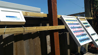
Lightfastness Test Frames set at an angle of 45degrees©Polly o'Leary2018
Test Frames set at an angle of 45 degrees

The Blue Wool Scale 1-8 card was half covered with a double layer of thick aluminium foil and also framed tightly to ensure good contact between the aluminium and the unexposed wool swatches.  This was then also hung out daily at an angle of 45 degrees.  When not hung outside in the sunshine, the frames were laid face down on a table and covered to ensure no other light reached the paints or the Blue Wool Card, so that the results would be more reliable.

Main Test Page with results©Polly o'Leary 2018
Main Test Page with results

 Each week the tests were checked against the Blue Wool Cards, any changes noted, compared to the Blue Wool Scale and recorded against the paint.  The amount of change was also compared against the Blue wool Scale Card at the end of the test and recorded as a comparison.  The end of the test was the point at which the Blue wool Scale 8 swatch was noted as having changed.  Thanks to the glorious summer weather, this happened in a fraction of the time anticipated.

Blue Wool Scale Card 1-8 showing changes in colour©Polly o'Leary 2018
Blue Wool Scale Card 1-8 showing changes in colour

From my tests, it has become apparent that we have a wonderful selection of colours which are highly lightfast - Yellows, Reds, Pinks, Purples, Blues, Greens and Browns.  These can be found in the PDF - just follow the link.  If you have a problem seeing the PDF please contact me and let me know.
Polly o'Leary Lightfastness Testing Results 2018 PDF


A note about the paints/colours I tested

When choosing paints, it's important to remember that the only reliable guide as to the colour is the Pigment number.  Manufacturers may give different colours the same names, or the same colours different names, or they may change the pigments and leave the name the same, but the pigment number (or numbers if it's a mixture/hue) will let you know what you are really buying. 
These paints are my own paints, the fugitive colours have never been used in a painting, they may have been acquired as part of a set, or bought specifically for the test, especially where age could conceivably affect the lightfastness.  The rest are colours that are useful from time to time, apart from a core of colours which I find myself using in almost every painting.

The results of the tests are my results, under the conditions in my garden this summer (2018) and using the paints and paper that I normally use, against this brand of Blue Wool Scale 1-8 Card.  You may see different results with different paper and paint under different lighting conditions.  
These tests were conducted completely independent of any manufacturer or provider of art supplies.

More on Lightfastness and Colour

Lightfastness Testing #1.html 

How Many Colours Do You Need To Paint Flowers?  

The Problem Of PY153 - New Gamboge, Indian Yellow  

Friday 15 June 2018

2018 Lightfastness Testing #1

In January this year I bought some Blue Wool Scale 1-8 Cards and made lightfastness charts with every watercolour paint that I have in the brands that I own.  This means I sometimes have more than one example of a colour to test.  I also included known fugitive colours, some accidentally acquired in sets or dot charts, and one - Rose Madder Genuine - bought for the occasion.

The charts were made with swatches on watercolour paper consisting of Mass Tone and a dilution which still gave a clear colour, and the thick aluminium masks were set so that they covered half the swatch.  The glass is normal picture frame glass to allow maximum light penetration.

The original intention was to use a light box fitted with UV lights, but as it turned out, the tubes weren't numerous or strong enough.  And my electricity meter was whizzing around far to quickly !

So, after setting up the frames and masks and putting everything together,  it was all shelved in the dark until the weather was right.

©2018 Polly o'Leary - Watercolour Paint swatches and Blue Wool Scale card 1-8
Watercolour Paint swatches and Blue Wool Scale card 1-8

The past week has been dry and even occasionally sunny so the test frames have been hung outside daily, facing as close to South as I can get.   I don't wait for sunshine, and hours arent counted as the light here in South Wales is so variable.  Any light will do as I have the Blue Wool Scale to compare with.
©2018 Polly o'Leary - Watercolour paint swatches facing South
Watercolour paint swatches facing South
©2018 Polly o'Leary - Blue Wool Scale 1-8 masked and hung facing South
Blue Wool Scale 1-8 masked and hung facing South

Interim results, at Blue Wool Scale 3 - after just 1 week are interesting.
 ©2018 Polly o'Leary - Blue Wool Scale 3 changes
Blue Wool Scale showing changes to first 3 swatches

Aureolin (yellow) PY40 (Daniel Smith)
The colour most noticeably changed.  It's gone dirty and brown.   My advice, avoid.  The last thing any artist needs is a yellow that goes dirty so quickly.  There are plenty of lovely yellows to play with that won't change so quickly.  If you're really attached to it, maybe do your own Lightfastness Testing.
©2018 Polly o'Leary - PY40 showing colour changing after only 1 week
Aureolin PY40 showing colour changing after only 1 week

Rose Madder Genuine NR9 (W&N)
This is a known fugitive colour and I can't say I know of many who would use it as there are any number of non fugitive alternatives.  However, it hasn't changed as quickly or as much as I expected.    Watch this space.

Brilliant Red Violet  PV1 (Schmincke)
The expected has happened.  The brightness has disappeared across the swatch leaving a reddish purple.  It will be interesting to see how this one develops as time goes on.

Brilliant Blue Violet PV1 (Shmincke)
As PV1 above.

Opera BV11, PR122 (Turner) and Rose Opera PR81:1 (Sennelier)
Both of these make no claim to lightfastness and it's clear to see why.  They have faded substantially in mass tone and diluted.  
However W&N Opera PR122 remains bright and unchanged so far.

Rose Madder Hue PR81, PR122 (Daler Rowney Aquafine)
This has shown clear changes already.  Faded in mass tone and diluted.   There are substitutes that won't change.

Prussian Blue PB27 (W&N, Schmincke)
This has faded substantially.  If it's a favourite of yours, you may wish to do your own lightfastness Testing.


 ©2018 Polly o'Leary - The main watercolour swatches - some showing changes
The main watercolour swatches - some showing changes


More on Lightfastness and Colour

Lightfastness Testing #2 - Results  

How Many Colours Do You Need To Paint flowers? 

The Problem Of PY153 - New Gamboge, Indian Yellow


Wednesday 16 May 2018

Meconopsis cambrica - Welsh Poppy

A native perennial with a taproot, even when it looks as if it’s been killed by the most severe winter, the Welsh Poppy will bounce back in the spring.  And it doesn’t need much soil, being happy to grow anywhere as long as there is moisture and a little sunshine.

When it came to choosing a native wild flower to paint, this elegant and delicate beauty was an obvious choice, it deserves more attention than it gets and makes a perfect subject for a watercolour painting.  Luckily, I had harvested a few seeds from wild plants some years ago.  I thought they were lost, but late in 2016, they started growing on the patch where they'd been sown. By spring last year, I had several small plants all showing good growth. As with all my paintings, my first move was to make studies of alll aspects of the plant, starting with it's growth habit and working through all the parts - even down to the tiny hairs on the buds and parts of the stems. Initial studies go in my sketchbook. Later studies are done on the paper I will work on.

Initial Leaf Studies Welsh Poppy©2018 Polly o'Leary
Initial leaf studies - Welsh Poppy

Initial Studies Welsh Poppy©2018 Polly o'Leary
Initial Studies - Welsh poppy

Painting Leaves Welsh Poppy©2018 Polly o'Leary
Painting leaves - Welsh poppy

Flower Studies Welsh Poppy©2018 Polly o'Leary
Flower studies - Welsh Poppy
 The bright yellow flowers were an enjoyable challenge. I had great fun finding the combination of yellows that would give depth and the correct colour, then working out how to portray the shadows without losing the glowing yellows.  

Yellows and Buds - Welsh Poppy©2018 Polly o'Leary
 Further studies on the flowers


Welsh Poppies on the Good Paper - Welsh Poppy©2018 Polly o'Leary
Welsh Poppies on the Good Paper
Close-up of the leaves - Welsh Poppy©2018 Polly o'Leary
Close-up of the leaves

 The leaves were a challenge all their own since they change colour even under daylight lamps. Painting them in daylight is clearly the answer, but in a cold, wet, Welsh summer, daylight is somewhat scarce and painting in the rain with watercolour not really practical.  Nevertheless, needs must and it was October by the time I was able to finish the painting, grateful for the mild autumn which allowed the plants to survive longer than usual.

Meconopsis cambrica - Welsh Poppy©2018 Polly o'Leary
Meconopsis cambrica - by Polly o'Leary

Friday 13 April 2018

The problem of PY153 – New Gamboge, Indian Yellow

PY153 New Gamboge, specifically the W&N version has been my favourite warm yellow, my ‘go to’ colour whenever I need a warm toned yellow. I’ve discovered too late that my tiny tube is about empty, having cut open the end and peeled back the tube has helped, but the day is fast approaching that it will finally be gone.

My first reaction was that there must be some left somewhere, I just have to find it. An evening spent online revealed that sadly, it's too late. There is no more to be had.

I thought that there might be a pigment available to artists that would be a good substitute. Several purchases later I haven’t found one that will serve the purpose. Those which looked promising online arrived and I find they are not as pictured. None will do. Despite being lovely colours in their own right, they are too close to orange and have almost no yellow, even in tints, despite being called yellow.

So I’m left with creating a mix.

The criteria – 
Permanent – all my paints are rated as highly lightfast. Transparent or Semi Transparent – PY153 was listed by W&N as Opaque, but mixing 2 colours to replace it, I feel it’s better to keep transparency if possible as I use it to mix other colours.  Non Granulating. Warm yellow but not orange.  Easily mixed to an exact replacement without endless colour correcting. Has the same colour constancy as PY153.  Works in mixes of greens and oranges producing the same range of colours as W&N New Gamboge PY153 (old).

It’s a tall order!

First I set about choosing the yellows to work with. After spending time looking at the qualities of PY153, I narrowed my choices down to three. Winsor Lemon PY175 (almost Transp.), Permanent lemon PY109 (Transp.), Sennellier Yellow PY154 (almost Transp.) – this pigment is also sold by W&N and others.

Next, I identified the likely candidates for mixing a credible match to PY153. These I narrowed down to Winsor Orange (yellow shade) PO62 (Opaque), Permanent Deep Yellow PY110 (Semi Opaque) and Winsor Yellow Deep PY65(Semi Transp.). I had hoped that Winsor Yellow Deep PY65 would be a like for like substitute after looking at the swatches on the W&N website but was sadly disappointed.

After a day of careful mixing, matching, and testing, I found that a mix of one from each group would make a very similar colour. However, I wanted as near identical as possible.


Polly's mixes to match New Gamboge PY153
For me, Permanent Lemon PY109 + Winsor Orange PO62 was the closest match and the easiest to get right quickly and reliably. Followed by Winsor Lemon PY175 + Winsor Orange PO62. Both PY110 and PY65 also make good matches with the Lemon paints but are a little trickier to get right.

The best I can recommend is to try out mixes with the colours you have, but make sure you have a good swatch of your New Gamboge PY153 (old) of choice to compare it with. Preferably on the same paper. Also, transparent or near transparent colours work best.
If you have any interesting colour mixes for New Gamboge PY153 (old) let me know.

 
More on Colour and Lightfastness

Lightfastness Testing #1 

Lightfastness Testing #2 - Results  

How Many Colours Do You Need To Paint flowers? 


Friday 17 June 2016

Paper Matters!

Lately, I have noticed that my favourite Watercolour paper has changed.  When I can work on it, it's jolly hard work - but without the jolly bit.   In fact, I have found myself with paintbrush in one hand and a brush full of gelatine size in the other.  I did at first think it was me.  Painting isn''t one of those things that you just sit down and do, some days it goes well, and some days you wish you were a photographer, although, I'm sure photographers have bad days too!

So it was with a heavy heart that I decided that I would look for another paper to work on.

I like working on Daler Rowney HP, but it only comes in 140lbs, which is ok for really small stuff, but not so good if you want to work bigger and have larger areas of paint.  It cockles.   And before someone tells me to stretch the paper first, yes, this works for some people, but I prefer to keep the sizing where it is, and anyway, that means I would have to keep several pieces ready prepared and stuck to boards, and since my studio space is tiny this really wouldn't work for me.  There's also the problem of availablility with DR HP, it being available in sheets only from one supplier which means a two hour plus round trip - and that's if I'm lucky!

So, as I was taking the trouble to test out several papers I thought it would be of interest to others and I'm putting it here, because there's quite a lot of information.

Each test was conducted with the same paints and brushes.  I tried to make sure the only variable was the paper, but the weather decided to get involved too and some of the tests were conducted on very hot dry days and some on very wet days, although I think the main problem that posed was drying speed so I haven't commented on speed of drying.

The paints - all from Sennelier -  French Ultramarine(PB29)  Sennelier Yellow Light (PY154 )  Rose Madder Lake(PV19) Sennelier Red(PR254) and Sennelier Olive (the old one PO49,PG36) I don't normally use ready mixed greens but this one is very useful as a base and is totally transparent.


Paper Tests - please click on the photos for a larger version

watercolour test on Papers from Saunders Waterford©Polly o'Leary2016
Papers from Saunders Waterford


Saunders Waterford HP 140lbs High White – New Improved 100% cotton

Fine surface, very smooth both sides.

W-in-W Paint spread on the damp surface quickly and blurred softly. Easy to soften edges.
Petal – Edge colour bled nicely, no manipulation needed. Markings fine and sharp.
Leaf – W in W spread almost too much but lovely soft result and well controlled. Subsequent dry brush work also soft.
Stem – paint spread from the edges nicely and a quick sweep of the brush down the middle created a nice ‘shine’ dry brush to edges softened nicely.
Edges clean-up ok if paint not too dry
Green paint – didn’t lift much after drying. Red paint – hardly any lifting after drying
All colours nice and bright. Reverse of paper seems easier to work on and results cleaner.
Some cockling even when dry, I would love to try this in a 200lb or 300lb version.

A lovely paper to work on, but lifting after drying is a problem.


Saunders Waterford HP 140lbs High White

Slight texture on surface. Reverse more regular pattern

W-in-W Paint spread on the damp surface quickly and blurred softly. Easy to soften edges.
Petal – Edge colour bled nicely, no manipulation needed. Markings fine and sharp.
Leaf – W in W spread almost too much but lovely soft result and well controlled. Subsequent dry brush work also soft.
Stem – paint spread from the edges nicely and a quick sweep of the brush down the middle created a nice ‘shine’ dry brush to edges softened nicely.
Edges clean-up ok if paint not too dry
Green paint – didn’t lift much after drying. Red paint – hardly any lifting after drying
All colours nice and bright. Despite texture, edges clean and fine lines clean.

Nice to work on but needed a little more water

Saunders Waterford Ultra Smooth HP 300gsm 50% cotton

Very smooth paper both sides

W-in-W paint spread nicely, needed a little extra work. Easy to soften edges. Red lifted well
Petal – Edge colour bled nicely, needed a little extra work. Nice effect. Sharp clean lines
Leaf – Needed extra work for W-in-W underpainting, but dry brushing very soft effect and clean sharp edges.
Stem – Very difficult to get effect
Green paint lifted leaving lighter green line. Red paint barely lifted leaving a slightly lighter red.
Edges clean and well defined and easy to clean up.
All colours bright.

Saunders Waterford Bockingford HP 300gsm White

Very smooth paper both sides.

W-in-W paint spread nicely and easy to control. Edges easy to soften. Red lifted well.
Petal - Edge colour spread nicely, good effect. Sharp clean detail lines
Leaf – W-in-W spread well, dry brush effect soft and deep. Edges easy to clean up.
Stem – W-in-W easy to control, highlight lifted nicely .
Green paint lifted leaving a clean light green line. Red lifted leaving a red line, but not sharp.
Edges clean and easy to clean up.
Colours bright.


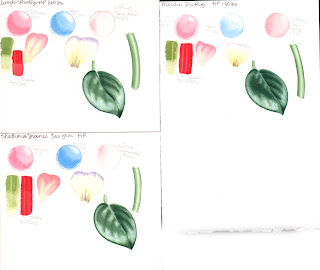
Watercolour paper test D-R Langton Prestige, Moulin du Roy and Strathmore Imperial 500
D-R Langton Prestige, Moulin du Roy and Strathmore Imperial 500


Langton Prestige HP 140lbs 100% cotton

Slight texture on one side and smooth on reverse. Feels very soft to the touch.

W-in-W - Paint dispersed nicely and edges softened nicely. Red paint lifted almost clean away.
Petal – edge paint bled nicely, little or no manipulation. Markings fine and sharp.
Leaf – W-in-W spread nicely, well controlled. Dry brush soft effect.
Stem – Edges pread nicely and easy to lift shine in the middle. Darker edging easy to soften.
Edges clean up easy
Green paint hardly lifted. Red paint both first and second layer lifted slightly.
All colours nice and bright. Texture didn’t affect clean edges or sharp details.

Lovely paper to work on.


Strathmore Imperial 500 HP 140lbs 100% cotton

Much heavier texture than most HP papers. Random texture on front and noticeable pattern on reverse.

W-inW inactive paint didn’t spread much. Difficult to soften edges. Red paint lifted almost clean.
Petal – Edge colour needed persuasion to soften. Fine lines needed more than one sweep.
Leaf - W-in-W spread far too much, soft effect but lacked control – maybe over compensation after first three attempts? Dry brush ok, not too harsh.
Stem – Took longer to persuade paint to spread, several attempts needed. Highlight present but mechanical looking.
Green paint lifted a little. Red paint sat on top of paper, but clean lines when lifted but not to white.
Paper cockled badly when wet but dried flat.

I found this a more difficult paper to work on.


Canson Moulin du Roy HP 140lbs 100% cotton

Very smooth paper, felt it was very like Arches.
W-inW paint spread well, but curiously when dried the colours seem faded. Difficult to soften edges and it shows! Lifting of the red unsuccessful.
Petal – Edge colour didn’t spread in and not successful. Colour when dried very feint.
Leaf – W-in-W spread well but colours feint and needed more than one wash. Dry brushing also needed more work. Effect soft.
Stem – W-in-W needed a lot of work. Doesn’t look as effective as others.
Green paint lifted well. Red paint sat on surface but lifted well, lines clear and defined, but not white.

Didn’t like working on this, and wasn’t impressed that the wash colours looked so faded

Watercolour paper Test Fabriano Artistico 640gsm (old)
Fabriano Artistico 640gsm (old)


Fabriano Artistico HP 640gsm (old) 100% cotton

This paper is a few years old. It’s difficult to tell which side is which even with a strong magnifying glass. Both sides are very smooth and I painted on both sides too.

W-in-W paint spread out nicely leaving a soft effect. Edges were easy to soften. Lifting of red was mostly successful.
Petal – Edge colour spread inwards beautifully and gave exactly the right effect. Sharp lines nicely defined.
Leaf – W-in-W spread nicely, easy to control. Dry brushing gave nice deep colour and very soft effect. Edges very sharp
Stem – W-in-W easy to control and highlight easy to lift leaving a convincing shine.
Edges cleaned up well
Green paint lifted leaving a slight colour. Red paint was lifted leaving lighter red.
Colours not quite as bright as Saunders Waterford and Strathmore, but well defined and clean.
Lovely paper to work on.

Watercolour Paper Test Fabriano Artistico 300gsm (old)
Fabriano Artistico 300gsm (old)


Fabriano Artistico HP 300gsm (old) 100% cotton

This paper is also a few years old, Both sides very smooth and difficult to tell back from front even with strong magnification.
W-in-W paint spread nicely, easily controlled. Soft effect. Edges easy to soften.
Petal – Edge colour spread inwards nicely, giving the effect wanted. Fine lines sharp and clean.
Leaf - W-in-W easily controlled spread. Dry brushing soft effect, no harsh lines/
Stem – W-in-W easy to control and highlight easy to lift.
Edges cleaned up well
Green paint lifted easily leaving lighter green. Red paint lifted leaving sharp lines of lighter red.
Colours not as bright as Saunders W and Strathmore but well defined and clean.
Lovely paper to work on but slight cockling.

 
50% cotton - SW Bockinford HP 140lbs and Fabriano Classico HP 140lbs
50% cotton - SW Bockingford HP 140lbs and Fabriano Classico HP 140lbs


Fabriano Classico HP (old)

W-in-W paint spreads nicely, soft edges easy to achieve.
Green (Senn. Olive), Red (PR254), Rose (PV19) Blue (PB29) All lifted similarly leaving a very light clean line

Smooth paper

SW Bockingford HP 140lbs  - this is from a large sheet.

I often use this paper if I want to try out different things, or just for sketching.  It's a lovely smooth paper which takes a wash nicely and also dry brushing.  It's also very consistent and reliable which is very useful if you're sketching, as you can concentrate on what you're doing, rather on coping with variable paper.