Friday 15 June 2018

2018 Lightfastness Testing #1

In January this year I bought some Blue Wool Scale 1-8 Cards and made lightfastness charts with every watercolour paint that I have in the brands that I own.  This means I sometimes have more than one example of a colour to test.  I also included known fugitive colours, some accidentally acquired in sets or dot charts, and one - Rose Madder Genuine - bought for the occasion.

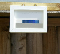
The charts were made with swatches on watercolour paper consisting of Mass Tone and a dilution which still gave a clear colour, and the thick aluminium masks were set so that they covered half the swatch.  The glass is normal picture frame glass to allow maximum light penetration.

The original intention was to use a light box fitted with UV lights, but as it turned out, the tubes weren't numerous or strong enough.  And my electricity meter was whizzing around far to quickly !

So, after setting up the frames and masks and putting everything together,  it was all shelved in the dark until the weather was right.
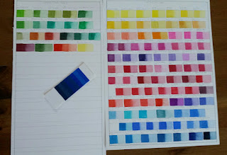
©2018 Polly o'Leary - Watercolour Paint swatches and Blue Wool Scale card 1-8
Watercolour Paint swatches and Blue Wool Scale card 1-8

The past week has been dry and even occasionally sunny so the test frames have been hung outside daily, facing as close to South as I can get.   I don't wait for sunshine, and hours arent counted as the light here in South Wales is so variable.  Any light will do as I have the Blue Wool Scale to compare with.
©2018 Polly o'Leary - Watercolour paint swatches facing South
Watercolour paint swatches facing South
©2018 Polly o'Leary - Blue Wool Scale 1-8 masked and hung facing South
Blue Wool Scale 1-8 masked and hung facing South

Interim results, at Blue Wool Scale 3 - after just 1 week are interesting.
 ©2018 Polly o'Leary - Blue Wool Scale 3 changes
Blue Wool Scale showing changes to first 3 swatches

Aureolin (yellow) PY40 (Daniel Smith)
The colour most noticeably changed.  It's gone dirty and brown.   My advice, avoid.  The last thing any artist needs is a yellow that goes dirty so quickly.  There are plenty of lovely yellows to play with that won't change so quickly.  If you're really attached to it, maybe do your own Lightfastness Testing.
©2018 Polly o'Leary - PY40 showing colour changing after only 1 week
Aureolin PY40 showing colour changing after only 1 week

Rose Madder Genuine NR9 (W&N)
This is a known fugitive colour and I can't say I know of many who would use it as there are any number of non fugitive alternatives.  However, it hasn't changed as quickly or as much as I expected.    Watch this space.

Brilliant Red Violet  PV1 (Schmincke)
The expected has happened.  The brightness has disappeared across the swatch leaving a reddish purple.  It will be interesting to see how this one develops as time goes on.

Brilliant Blue Violet PV1 (Shmincke)
As PV1 above.

Opera BV11, PR122 (Turner) and Rose Opera PR81:1 (Sennelier)
Both of these make no claim to lightfastness and it's clear to see why.  They have faded substantially in mass tone and diluted.  
However W&N Opera PR122 remains bright and unchanged so far.

Rose Madder Hue PR81, PR122 (Daler Rowney Aquafine)
This has shown clear changes already.  Faded in mass tone and diluted.   There are substitutes that won't change.

Prussian Blue PB27 (W&N, Schmincke)
This has faded substantially.  If it's a favourite of yours, you may wish to do your own lightfastness Testing.


 ©2018 Polly o'Leary - The main watercolour swatches - some showing changes
The main watercolour swatches - some showing changes


More on Lightfastness and Colour

Lightfastness Testing #2 - Results  

How Many Colours Do You Need To Paint flowers? 

The Problem Of PY153 - New Gamboge, Indian Yellow


Wednesday 16 May 2018

Meconopsis cambrica - Welsh Poppy

A native perennial with a taproot, even when it looks as if it’s been killed by the most severe winter, the Welsh Poppy will bounce back in the spring.  And it doesn’t need much soil, being happy to grow anywhere as long as there is moisture and a little sunshine.

When it came to choosing a native wild flower to paint, this elegant and delicate beauty was an obvious choice, it deserves more attention than it gets and makes a perfect subject for a watercolour painting.  Luckily, I had harvested a few seeds from wild plants some years ago.  I thought they were lost, but late in 2016, they started growing on the patch where they'd been sown. By spring last year, I had several small plants all showing good growth. As with all my paintings, my first move was to make studies of alll aspects of the plant, starting with it's growth habit and working through all the parts - even down to the tiny hairs on the buds and parts of the stems. Initial studies go in my sketchbook. Later studies are done on the paper I will work on.

Initial Leaf Studies Welsh Poppy©2018 Polly o'Leary
Initial leaf studies - Welsh Poppy

Initial Studies Welsh Poppy©2018 Polly o'Leary
Initial Studies - Welsh poppy

Painting Leaves Welsh Poppy©2018 Polly o'Leary
Painting leaves - Welsh poppy

Flower Studies Welsh Poppy©2018 Polly o'Leary
Flower studies - Welsh Poppy
 The bright yellow flowers were an enjoyable challenge. I had great fun finding the combination of yellows that would give depth and the correct colour, then working out how to portray the shadows without losing the glowing yellows.  

Yellows and Buds - Welsh Poppy©2018 Polly o'Leary
 Further studies on the flowers


Welsh Poppies on the Good Paper - Welsh Poppy©2018 Polly o'Leary
Welsh Poppies on the Good Paper
Close-up of the leaves - Welsh Poppy©2018 Polly o'Leary
Close-up of the leaves

 The leaves were a challenge all their own since they change colour even under daylight lamps. Painting them in daylight is clearly the answer, but in a cold, wet, Welsh summer, daylight is somewhat scarce and painting in the rain with watercolour not really practical.  Nevertheless, needs must and it was October by the time I was able to finish the painting, grateful for the mild autumn which allowed the plants to survive longer than usual.

Meconopsis cambrica - Welsh Poppy©2018 Polly o'Leary
Meconopsis cambrica - by Polly o'Leary

Friday 13 April 2018

The problem of PY153 – New Gamboge, Indian Yellow

PY153 New Gamboge, specifically the W&N version has been my favourite warm yellow, my ‘go to’ colour whenever I need a warm toned yellow. I’ve discovered too late that my tiny tube is about empty, having cut open the end and peeled back the tube has helped, but the day is fast approaching that it will finally be gone.

My first reaction was that there must be some left somewhere, I just have to find it. An evening spent online revealed that sadly, it's too late. There is no more to be had.

I thought that there might be a pigment available to artists that would be a good substitute. Several purchases later I haven’t found one that will serve the purpose. Those which looked promising online arrived and I find they are not as pictured. None will do. Despite being lovely colours in their own right, they are too close to orange and have almost no yellow, even in tints, despite being called yellow.

So I’m left with creating a mix.

The criteria – 
Permanent – all my paints are rated as highly lightfast. Transparent or Semi Transparent – PY153 was listed by W&N as Opaque, but mixing 2 colours to replace it, I feel it’s better to keep transparency if possible as I use it to mix other colours.  Non Granulating. Warm yellow but not orange.  Easily mixed to an exact replacement without endless colour correcting. Has the same colour constancy as PY153.  Works in mixes of greens and oranges producing the same range of colours as W&N New Gamboge PY153 (old).

It’s a tall order!

First I set about choosing the yellows to work with. After spending time looking at the qualities of PY153, I narrowed my choices down to three. Winsor Lemon PY175 (almost Transp.), Permanent lemon PY109 (Transp.), Sennellier Yellow PY154 (almost Transp.) – this pigment is also sold by W&N and others.

Next, I identified the likely candidates for mixing a credible match to PY153. These I narrowed down to Winsor Orange (yellow shade) PO62 (Opaque), Permanent Deep Yellow PY110 (Semi Opaque) and Winsor Yellow Deep PY65(Semi Transp.). I had hoped that Winsor Yellow Deep PY65 would be a like for like substitute after looking at the swatches on the W&N website but was sadly disappointed.

After a day of careful mixing, matching, and testing, I found that a mix of one from each group would make a very similar colour. However, I wanted as near identical as possible.


Polly's mixes to match New Gamboge PY153
For me, Permanent Lemon PY109 + Winsor Orange PO62 was the closest match and the easiest to get right quickly and reliably. Followed by Winsor Lemon PY175 + Winsor Orange PO62. Both PY110 and PY65 also make good matches with the Lemon paints but are a little trickier to get right.

The best I can recommend is to try out mixes with the colours you have, but make sure you have a good swatch of your New Gamboge PY153 (old) of choice to compare it with. Preferably on the same paper. Also, transparent or near transparent colours work best.
If you have any interesting colour mixes for New Gamboge PY153 (old) let me know.

 
More on Colour and Lightfastness

Lightfastness Testing #1 

Lightfastness Testing #2 - Results  

How Many Colours Do You Need To Paint flowers?